Comcast Business
Enterprise Franchise View
Enterprise customers needed a solution for self service that gives access to the right information for users of all levels and affiliations. With the Franchise View project we provided that solution and advanced the usage of the Enterprise Access Center in spades.
Role:
Team:
Product owners and managers, a UX Lead, an Associate Creative Director, a copywriter, a development architect, full-stack developers, and a project manager.The Problem
Okay, that's who's who, but who owns what?
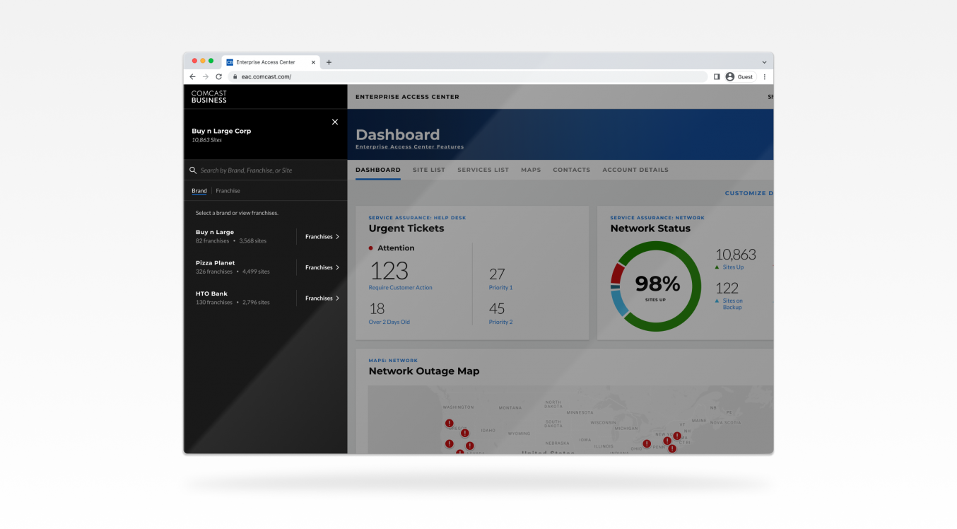
Self service for large enterprise customers looks a little different when multiple users at all levels in an organization need access to the right information. Now, add that to the complexities of franchise ownership and agreements that span multiple brands and corporations and you have a hot mess of interconnected offices, stores and restaurants.
Current access to the portal was flat, so we added more levels
Some franchises have multiple brands or corporations

We needed to allow users to be able to access all levels

However those levels of hierarchy are structured for an enterprise customer, the user would need an ability to select any group of sites in that hierarchy and filter all data in the portal to just those sites. I lead the designs on what we called the Franchise View Picker that would give the user options to choose that view.
The Research
So, your business is complicated?
To better understand the many particular needs for the Franchise View Picker, we conducted in-depth interviews with users of all levels and presented them two design concepts.

Concept A which we affectionately called "The Dark Side of the Nav" pushed the entire view of the experience to the side and revealed the Franchise View Picker to the left of everything. The idea is that it should appear to go beyond the navigation because whatever is selected here is applied to the whole experience. It also utilized a similar design pattern to MacOS's column view in Finder where items could open up to more items below them in the hierarchy for selection. It also had a minimal design aesthetic.

Concept B which we called "Nested Doll" was an experience that presented one panel for a level in the hierarchy at a time. Users could open a higher level in the hierarchy to reveal lower items within it - like Russian dolls. The UI also was much lighter and had more color for typographical hierarchy. It also presented more detailed information about each item in the panels. It also differentiated from the "Dark Side of the Nav" concept in that the panel opened over top of the experience.
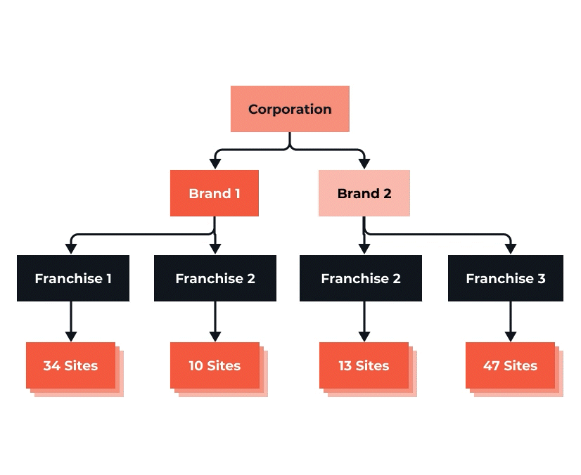
We chose users who had varying enterprise structures to apply to the Franchise View:
- Companies with only franchises under the corporate entity
- Companies with brands under the corporate entity and then franchises
- Companies with "blended franchises" (franchises with more than one brand)
For each user test, we alternated which concept they saw first so that the learning curve was more evenly applied to both concepts across all the testing.
The Insights
Can I get a little of both?
Test participants ended up being somewhat split between the two concepts, but elements of the Nested Doll concept resonated best with them.
- The interaction was clearer to them.
- The information for individual items was helpful.
- They preferred color hierarchy and clear labeling of interactive elements.
- They preferred the panel by panel concept over the columned approach.

The Dark Side of the Nav concept had its share of positives as well. They liked how it appeared clean and streamlined and how it didn't overlap the page to cover what's below. We also were encouraged that for either concept, the participants understood the menus and found the structure relevant, but they called out that nomenclature of the levels might differ across different customer organizations.

Since the preferences were almost split between the concepts and our larger design team considered the movement of the Dark Side effective for future projects, we decided to merge the two concepts. We took the best parts of the Nested Doll like the additional information, color hierarchy, and overall panel-by-panel functionality and combined them with the positioning and color scheme of the Dark Side of the Nav.
Design
The “Dark Side of the Nested Doll”? Maybe just the MVP.
I designed the new combination of concepts for our MVP and worked out some other issues around the blended franchises. This new version simplified elements of the Nested Doll concept and removed all unnecessary UI elements. You can click around in the prototype below or expand to see it in better detail.
The Results
Sell! Sell! Sell!
In enterprise, features sell. Our enterprise sales folks started selling this feature way before we even finished because customers are that excited for it. It also opens up a lot of doors to thousands more users in the portal which gives us many more opportunities for enhancements to the experience.
This feature was also included in the Comcast Business Web Experience to win a Bronze Stevie(R) Award for Achievement in User Experience along with the Service Status Center.