Comcast Business
Service Status Center Web App
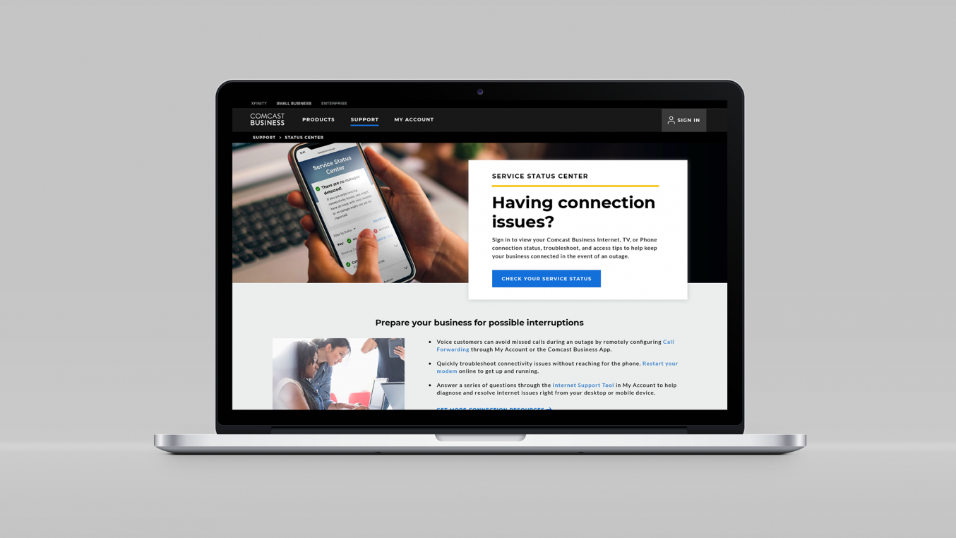
The Comcast Business Service Status Center is an authenticated self-service experience where customers can view all of their linked accounts and see at any time if they are experiencing service outages or not. I worked with a team of researchers, product owners, and developers to plan, design, and develop this net new application.
Role:
Team:
Product owners, a junior UX designer, a copywriter, front-end developers, back-end developers, and a project manager.The Problem
Wait, is there an outage or what?
Comcast Business customers were not able to sufficiently self-serve with our web properties to resolve their issues with outages or get any answers about what might be happening to their services.
Outage related issues were nearly 40% of all calls

Outage related issues were the top search terms on the website

The organic search result for “Comcast Business Outage”:

The Research
Meeting customers where they work
A central location for outage information could better serve these users seeking help in this aggravating moment of their customer journey. But first, we wanted to know more about that moment and how our current properties handled it.
Through in-depth interviews with customers of varying technical proficiency we found:
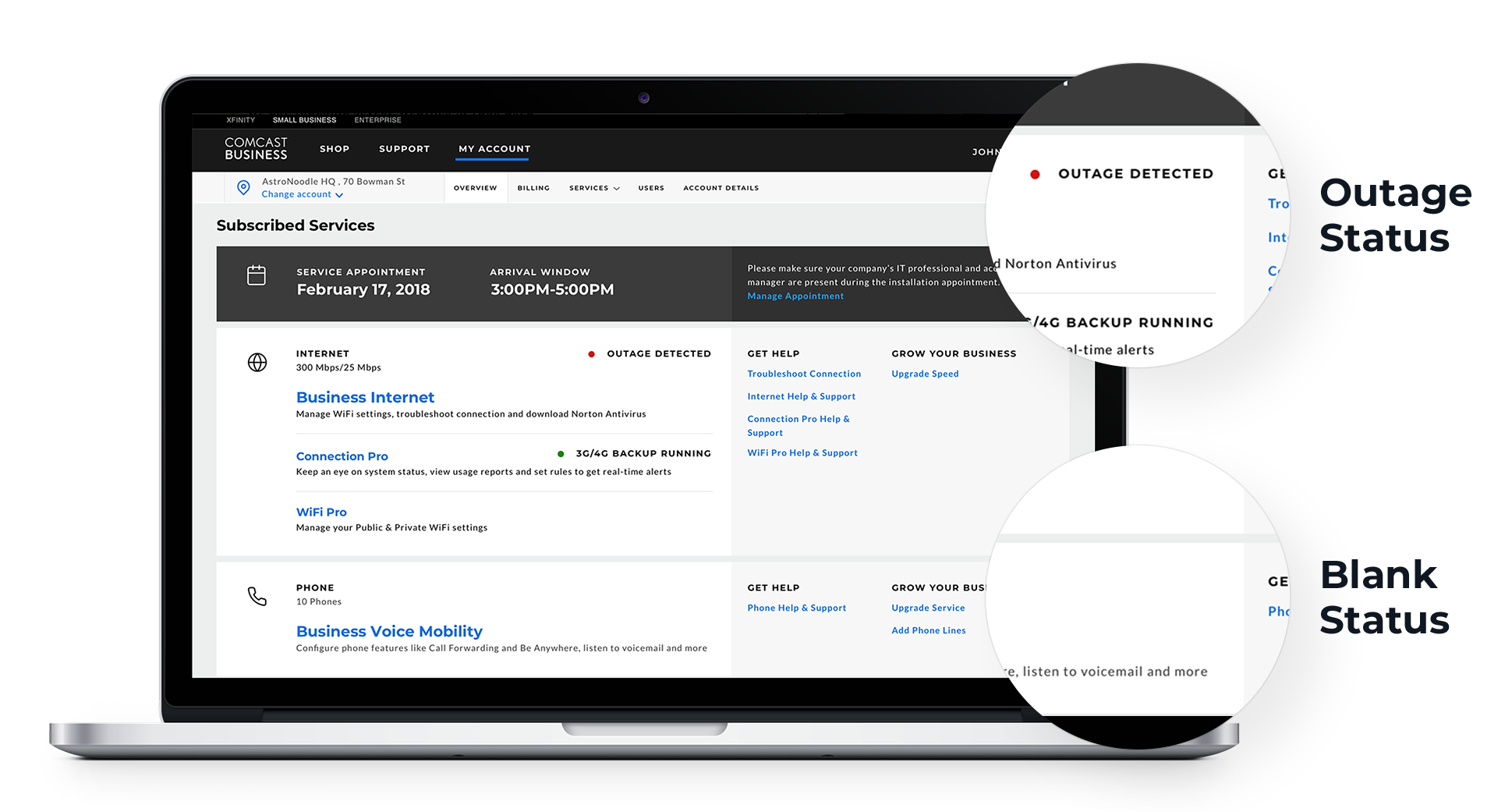
- Customers were confused with status indicators that were only present during an outage – not when everything was alright.
- Outages have serious impacts on their businesses, so there is business value for information about regaining connection or other ways to bring people back online.
With this guidance we created status center prototypes for our concept testing round of research. The prototypes included multiple concepts that we thought could provide value to a user experiencing an outage. We also wanted to gauge interest for a status center with a map vs. one without.


The Insights
Customers react to concepts
We were surprised to see how much participants preferred a map. To them, the map provided:
- The perception of additional transparency.
- The idea that they might not be alone in their outage.
- The ability to plot accommodations for their employees to continue work elsewhere.

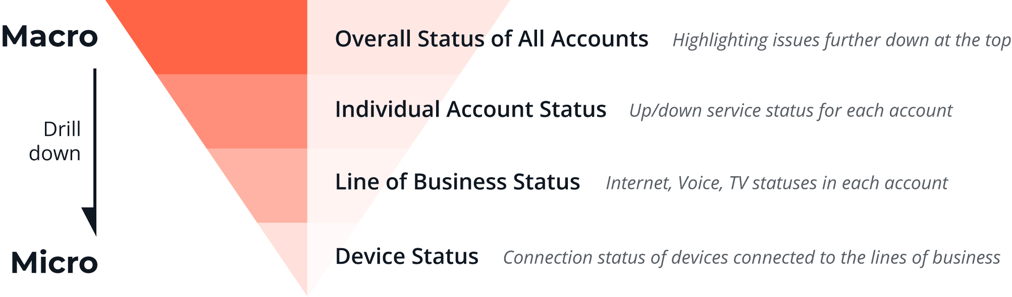
We also found that our users’ actual mental model was flipped from the one we presented. They wanted to first see information on a macro-level (all of their accounts) and then work their way down to individual accounts, then to specific services, and finally, to device connectivity -- an inverted pyramid of connection granularity.


To our surprise, an outage reporting method and concept proved ineffective because users still wanted to chat with a human so that their report is recorded. Based on this finding, we decided to offer a simpler solution rather than building out a full-fledged reporting mechanism.
Design
Who's the real MVP? (Most Viable Product)
We designed our Phase 1 our newly dubbed Service Status Center working with AGILE development teams and aggressive launch dates.

Although the map version of the product resonated most, we could not launch an application with a map immediately. So, we designed components and patterns that could easily work with or without the map.

To adhere to the mental-model, customers with more than one account would first see an overall status of all of their accounts, followed by a list of those accounts and their statuses. Each item in the list also expanded to see individual lines of business.
The Future
It's literally iterative
I worked with our talented team of developers to launch the first phase of the Services Status Center in late 2019. Since then, the team has iterated on the MVP phase-by-phase to finally end up with a product that supports all SMB customers with a detailed map view.